Who wants cake? Anybody? Cake? No? Just me?
About Me
- Name: Pops
- Location: The 951, California, United States

I'm very interesting. I would describe myself as witty and insightful, but that wouldn't make either true. I have two degrees in history from the least prestigious University of California campuses. As a result, I stay home full time with my kids. If anyone can think of anything useful to do with a history MA, please don't hesitate to share.
Send me e-mail

The Movies I Have No Intention Of Seeing Series
The Pops' Bucket MSPaint Gallery d'Art
Lives More Interesting Than My Own
Liberalia: Places I Go To Reinforce Opinions I Already Have
Pops' Bucket Hall of Minimal Suckitude
War On Christmas: Letters Home
Archives
July 2004
August 2004
September 2004
October 2004
November 2004
December 2004
January 2005
February 2005
March 2005
April 2005
May 2005
June 2005
July 2005
August 2005
September 2005
October 2005
November 2005
December 2005
January 2006
February 2006
March 2006
April 2006
May 2006
June 2006
July 2006
August 2006
September 2006
October 2006
November 2006
December 2006
January 2007
February 2007
March 2007
April 2007
May 2007
June 2007

This work is licensed under a Creative Commons License.
Sunday, November 06, 2005
I Am Meandering
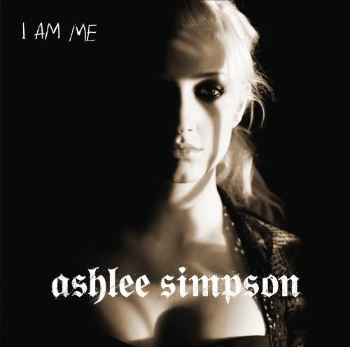
This is the cover of Ashlee Simpson's latest album.
You can laugh if you want to, but it speaks to me. It speaks to me down at the core of my being, into what I call my "third ear", my spiritual ear that hears the faint, invisible thrum thrum thrum of the universe. I found it in a dumpster behind a hospital. I'm not really sure where the "core of my being" is, so I just keep it in my pocket. My pants pocket.
The things this picture says to me are very specific; specific enough to be enumerate and, say, transcribe into a blogpost for your reading pleasure. Or rather: "for your reading." They are:
1) Chin dimple, fine. Nose dimple, fine. Chin dimple and nose dimple? Very poor craftsmanship at the Indonesian factory where you were sewn together from the leftover bits of Britney Spears and Jewel.
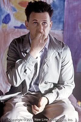
2) I Am Me. Very defensive-sounding. Also very "Hooked on Phonics". But mostly it makes me think of this guy:
3) For a right-handed guy, father/manager Joe Simpson can still bring it with the back of his left hand if he needs to.
4) If she's going to use that font for her name, this album had better include a kick-ass cover of something by Testament or Megadeth. We already know she can howl atonally, so she's half way to being a thrash metal god already.
5) The Goth look is never wrong. But she's still 4 layers of pancake and airbrush from Robert Smith of the Cure. If you're going to do it, do it. I'm talking to you too, Billie Joe Armstrong.
6) With just the right lighting at just the right angles, boobs can be made to look weird. It's a powerful gift she has for ruining things that even makes me question my commitment to mammaries. I acknowledge your ascendant puissance, unparalleled in the field of Crapitude, Ms. Simpson. Long has it been since anyone has shown this level of ability to produce things that are wholly forgettable. Where are you when we need you, Vanilla Ice?
For the life of me, I can't figure out what the marketing sense behind this cover is supposed to be. I mean, the ideal market for her music, I would imagine, would be girls her own age who would best be able to identify with her struggles as an unjustly famous person in the public eye and a personal worth in the tens of millions of dollars.
The picture used must have been consciously chosen. And yet the specific choice has been made to include her rack as the centerpiece of the composition, even splaying her name dramatically across it. Leaving Freudian symbolism and subtext aside, wouldn't that be more effective marketing if the target audience was young men? Is anyone going to buy the album just because it shows half a heaving breast on it? Especially when they can come to Pops' Bucket and see the picture for free...
Welcome, pervs!
This post on the Narcissus Scale: 2.1
Pops
- posted by Pops @ 9:36 PM

![]()